
Deloitte Internal Dashboard
Designing clarity, efficiency, and a better workday
As part of my role at Deloitte, I led the UX/UI design of a comprehensive internal dashboard tailored for employees. The platform centralizes key data, tracks project performance, and simplifies daily operations — all within a clean, user-focused interface designed to enhance productivity across the organization.
Employee Dashboard
I designed Deloitte’s internal employee dashboard and personal area — a clear, intuitive system that streamlines access to key tools and personal information, enhancing the daily experience of thousands of employees.
The UX Process


The Process
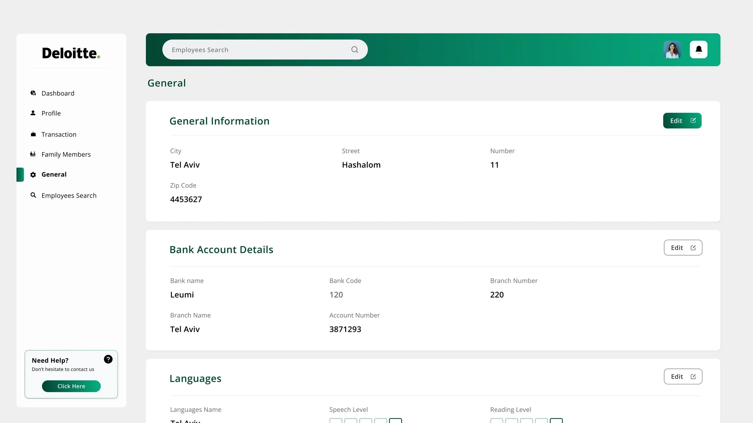
Sidebar Navigation
The vertical sidebar was designed with icon-based UI and a clear navigation hierarchy to promote fast orientation within the dashboard. Using a sticky sidebar layout, it remains consistently visible, improving accessibility. Active states are visually emphasized, supporting intuitive interaction. The component adheres to Deloitte’s visual consistency, employing branded colors and rounded containers for a modern yet friendly tone.

KPI Cards
Key performance indicators are displayed using a card-based layout, optimized for responsive design across screen sizes. The cards follow a clear visual hierarchy, with bold titles, large numeric values, and micro-interactions that invite engagement. The layout allows quick scanning and prioritization of essential metrics at a glance.

Annual Performance Summary
This area utilizes a vertical stacked bar chart to reflect annual trends, helping users identify performance shifts over time. Through subtle data visualization techniques, it presents a holistic overview without overwhelming the viewer. Labels and tooltips support deeper understanding while maintaining visual clarity.

Profile Edit Popup
Seamless UX with Brand Consistency
The edit profile popup was designed to keep the user focused on the task without navigating away from the main profile page. The layout emphasizes clarity and accessibility, with a clean structure and logical field order from basic personal details to role selection. The design maintains Deloitte’s visual identity while ensuring a smooth and intuitive user experience.

Top Bar
The top bar includes a global search field, designed with a soft gradient UI and a rounded pill shape that reinforces the clean, data-centric look of the interface. Profile access and notifications are placed following intuitive UX patterns, ensuring a familiar experience for users. The design emphasizes clarity, quick access, and a sense of affordance through visual cues.

Monthly Performance Summary
A donut chart was used to visualize time tracking data across activity categories like client work, admin tasks, and absences. The design uses soft tones to reduce cognitive load, while the layout supports temporal filtering via a month picker. This allows for dynamic insights into time distribution patterns.

Billable Hours Target
This line chart illustrates a year-over-year comparison between billable hour goals and actual logged hours for 2023 through 2025.
Its thin, clean lines and use of Deloitte’s branded green palette reinforce brand consistency while maintaining strong visual clarity.
The contrasting green tones differentiate target vs. actual, supporting quick cognitive recognition and enabling users to spot trends at a glance a core principle in effective data visualization.
The current year (2024) is subtly highlighted with a bold green circle, enhancing user focus and serving as a clear visual anchor within the chart’s flow. Overall, this section strikes a deliberate balance between aesthetic simplicity and analytical precision ensuring the UI is not only on-brand but also user-centric.

Client
Deloitte
year
2023